Onboarding
Purpose
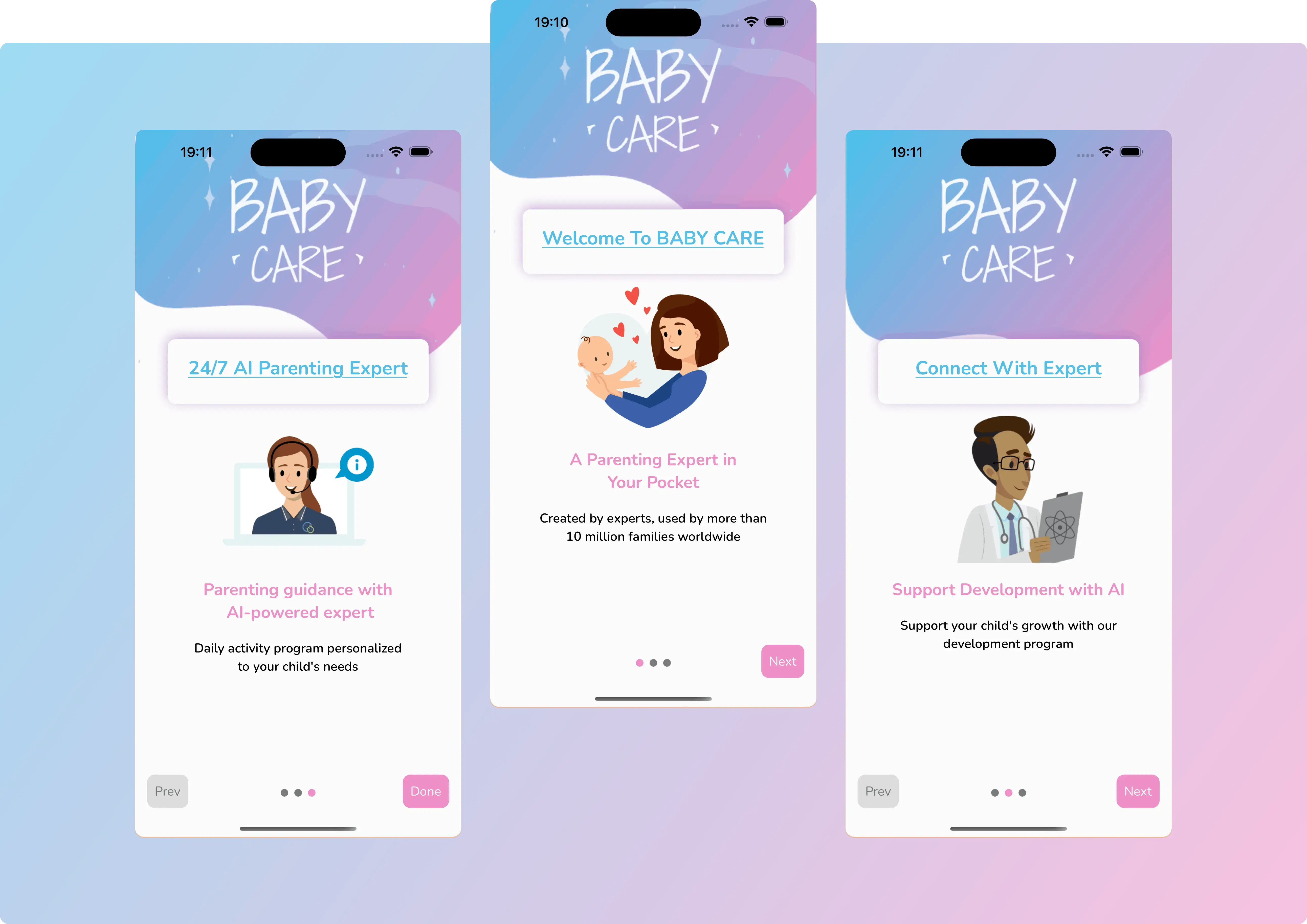
The onboarding process introduces users to the app experience using visually rich slides, followed by a redirection to onboarding questions after completion.
Features
- Custom Slide Rendering: Each slide includes:
- Top banner image (
bannerImage) - Title (
item.title) - Middle image (
item.image) - Subtitle (
item.text) - Caption (
item.caption)
- Top banner image (
- Navigation Controls:
- Next, Prev, and Done buttons with custom styles
- Dot pagination for slide indicators
- Transitions:
- Upon completion,
is_onboarding_completedis saved in storage - Navigates to the onboarding questions screen using a helper function
- Upon completion,
File References
- Slide Data Source:
- Defined in
constants/API_RESPONSES.tsasINTRO_SLIDES
- Defined in
- Components Used:
TopBannerContainerThemedTextThemedView
- Helpers Used:
setStoragefromhelpers/helper.tstoOnboardingQuestionsfromhelpers/navigation_handler.ts
Custom Styling
Custom styles are defined for:
- Button appearances (Next, Prev, Done)
- Dot indicators (active and inactive)
- Layout and alignment of slide content
Related Folder Structure
|components
│└── TopBannerContainer.tsx
|constants
├── API_RESPONSES.ts ← contains INTRO_SLIDES
|screens
├── IntroSlider.tsx